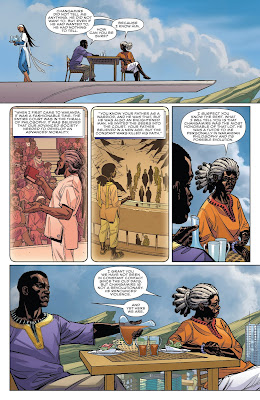
When I heard that Ta-Nehisi Coates—long one of my favorite writers—and Brian Stelfreeze—long one of my favorite artists, not to mention favorite people—were teaming up to work on a Black Panther monthly, I was over the moon excited. These pages show exactly why.
All right. So this is from the fourth issue. By now the readers are already well acquainted with these characters: T'Challa, who's the king of Wakanda—as well as being the Black Panther, of course—and Ramonda, his stepmother, the queen mother. But even if you didn't know any of that, even if these were the only two pages you'd ever read, you'd get much of that from the dialogue, which uses their names and/or titles unobtrusively, clueing you in to their relationship and artfully filling in some previously unknown but important backstory, as well as some of the nuances of their own relationship.
Now look at the elegance of the way each page is composed. The first with its bookends of widescreen panels, while the middle tier is composed of identically sized vertical panels, is a model of balance. The two widescreen panels show essentially the same thing, T'Challa and Ramonda having breakfast. But because the second is significantly panned in, there's nothing monotonous about repeating a similar shot. Similarly, each panel in the middle tier is the same shape and size (save for the round panel borders on the first two, denoting that they're flashbacks, and major damn props for the old school storytelling there), with one character in each the primary focus. But because Brian moves the camera in and out, up and down, each image feels fresh. Adding to all this, of course, is absolutely stellar color work by the magnificent Laura Martin, who not only renders the very first panel as though Maxfield Parrish were painting a Wakandan cityscape, but adds to the clarity of the flashbacks by going monochromatic, but using a different palette for each, to denote different times in the past.
The second page, by contrast, is just as elegantly laid out, but Brian chooses an alternate approach: again, three tiers, but this time only the middle tier is widescreen, while the first has three equal sized panels and the bottom two. Again, a perfectly balanced page, but with enough variety to keep the eye fully engaged—and note, too, how often on this second page we're treated to subtle downshots: literal bird's eye views of this high high above the city's streets scene.
But here's the thing. Check out the way Brian reveals how T'Challa is feeling during this conversation. It starts with him sitting at the table, but as the talk progresses, he moves further and further away from his stepmother—except that they're on a balcony, so there's only so far away he can move. But he gets every bit as far away as possible, until by the final panel, his heels seem to literally be hanging over the edge.
Now, if he were any other character, you'd infer from this that the guy was suicidal, or at least reckless, or perhaps drunk or even just plain stupid. But T'Challa is precisely none of those things: he's the Black Panther, which means he's in complete command of his body. He knows exactly where he is and what's perfectly safe for him to do, even if it wouldn't be for just about any other human. He knows he's not going to fall, but if he were to, he wouldn't be killed on account of his suit—although, even then, things probably wouldn't get to that point, as he'd be able to arrest his fall, most likely, because, again, he's the Black damn Panther, and that's how badass he is.
Or how badass he can be. He's only this badass in this exact situation because of the choice his badass artist made to show, in one small understated panel, this subtle, incisive bit of characterization.


No comments:
Post a Comment